UX/UI · Worku and Tuni’AR

UX/UI: customer journeys and interfaces.

I find where a journey loses the visitor, then I clear the path to the action. It’s the same logic as a buying journey.

Sections 01 to 05: the website of the Worku SaaS, in 2026. Then two mobile apps designed during my Tuni’AR internship, in 2024.
01 · The journey audit

Where the journey broke.

I mapped the five stages a visitor passes through, then marked where each one loses them.

  • Unclear entryThe first screen spoke to everyone, so it spoke to no one.
  • No segmentationRecruiters and sales teams shared one path.
  • Undemonstrated productThe four steps of the product were never shown in order.
  • Vague actionsCommencer maintenant didn’t say what happened next.

02 · Structure first

Boxes before pixels.

Before choosing a colour, I settled what goes where and in what order.

03 · The promise, before / after

From what it is, to what you get.

Before

Leads with the category. The button, Commencer maintenant, names no outcome.

After

Leads with the task and its result. The button, Lancer une recherche gratuite, names both.

04 · Separate journeys

A recruiter and a sales rep are not the same visitor.

They arrive with different words and different jobs. One page could not serve both, so I built four.

2audiences separated: recruiters and sales teams

4dedicated pages, up from one general page

Same layout, same product, deliberately different words. Read the two headlines against each other.

Recruiters
Sales teams

The other two pages complete the four and are live to read: recherche-profils for searching profiles and companies, and enrichissement-contacts for unlocking a verified email or mobile. They support the count without asking you to look at two more near-identical screenshots.

05 · Mobile

Text before decoration.

Before
After
  1. Text before illustrations. The message arrives before the artwork.
  2. Buttons higher. The action sits where a thumb already is.
  3. Shorter page. Less scrolling to reach the same decision.

Honest limits

What this redesign does not prove

  • No conversion claim. There was no continuous, complete tracking in place during the internship, so I cannot show a conversion lift and do not claim one.
  • No A/B test. These were reasoned design decisions applied to a live product, not a controlled experiment.
  • The message is verifiable, the impact is not. You can load worku.tn and read the new promise. That is the part I can prove.

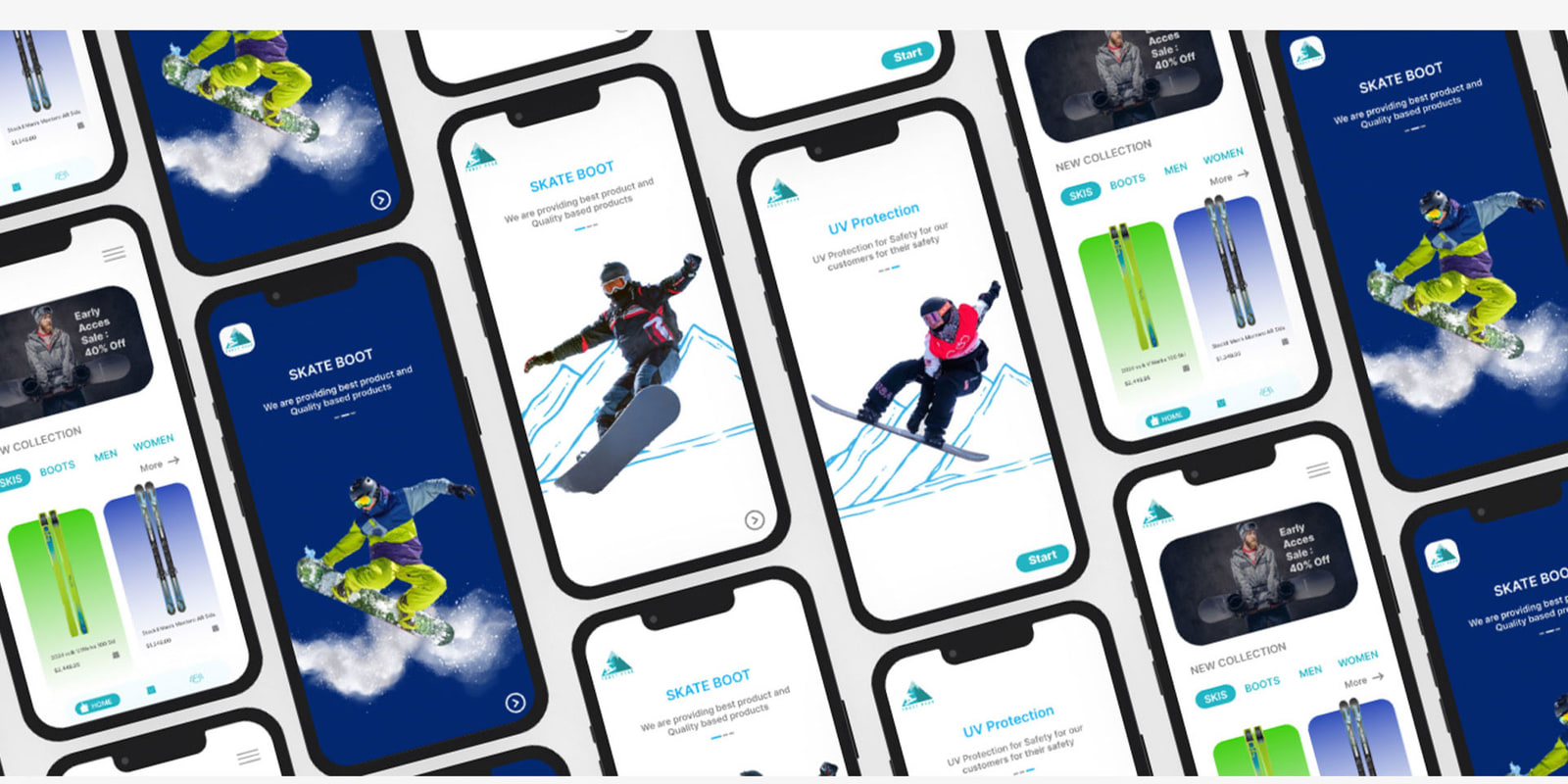
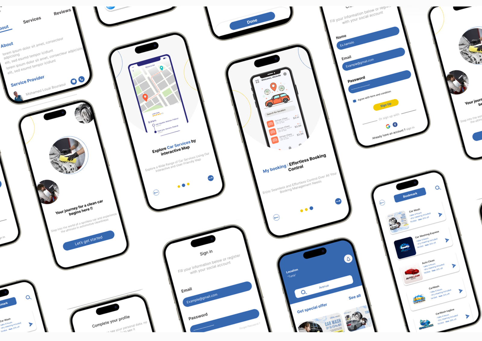
Tuni’AR · 2024 · Mobile app design

Two apps, research to final UI.

Before Worku, the same order on a smaller surface: understand the errand, wireframe it in grey, then design it.